
Lost & Found
This is a brand identity for Lost & Found, a curated vintage boutique. The attitude of the store is lively and genuine. They value self-expression, experimentation, individualism, and refined imperfection with their main goal being to make fashion approachable. They want to be more than just a store, but a lifestyle.


( I organized and shot all photos used in the project. with the help of lovely friends as models, stylists, & extra hands )

IDENTITY //
The logo for Lost & Found is a modified typeface. I wanted to create something that could be used single color so it could be casually applied to whatever needed. I created it by cutting the letters and dropping them on the page until I found a composition that was the perfect combination of casual and intentional. The ‘O’s represent being empty and being full, being lost and being found. the pause between the ‘L’ and the first ‘O’ is to bring attention to this.
The secondary logo is a modified ‘?!’. ‘?’ representing lost and ‘!’ representing found. It’s about finding your confidence and being ok with uncertainty. It also has the energy of being bold and loud and going for things even if you feel insecure. The period below the ‘?’ is moved to the ‘!’ to show the movement into confidence. Also to repeat the dots in the main logo.
The typefaces are a mixture of styles to reflect the mixture of styles found at a vintage clothing store. References to old type as well as new and a combination of serif and sans serif achieve a funky but balanced combo.
For the colors, I wanted it to be fun without being childish and bright without leaning to too feminine or too masculine.


Store publication
//
This is a newspaper designed to be stacked in the store, free for customers to take. It is a general statement of the stores mission featuring related articles. This would be changed out once or twice a year. It is designed in a way so it feels less like a store catalog and more like a coffee table piece.


Quarterly publication
//
Because Lost & Found prioritizes brand/customer relationship, I designed a Quarterly. This is a package that would be mailed out every season to customers who sign up. It would feature a look book for the season with articles on theme. It would also include a “street” styler which features everyday people expressing their style to encourage the companies message of individualism and personal style. In addition, it will have a guide of some sort. This issue has a guide to accessorizing. It would also include any event invitations or coupons related to the season.


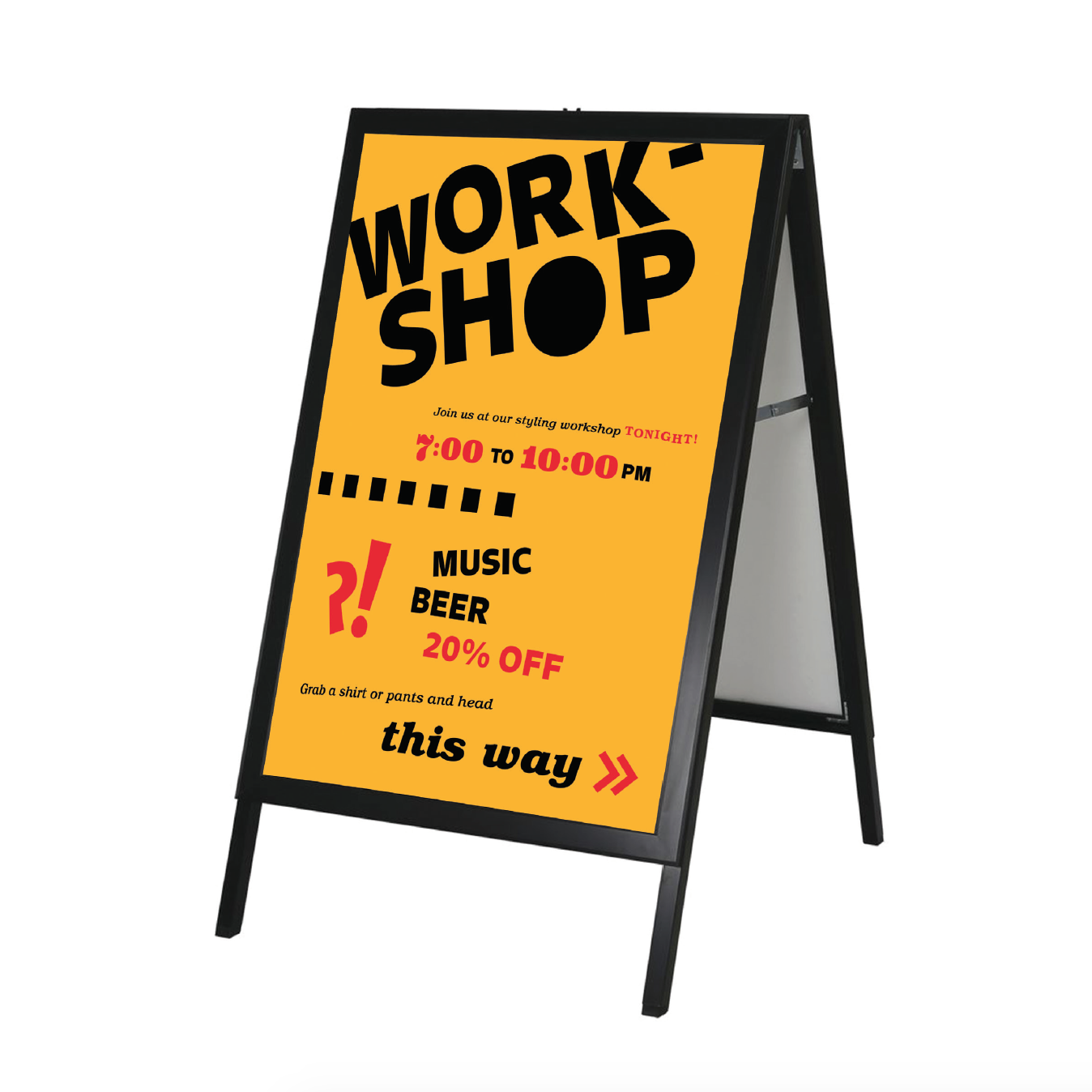
event
//
To encourage community and engage with customers Lost & Found often hosts events. This event was a styling workshop. I wanted the design to mimic the casual and playful vibe of the store so I used hand done elements like paint cut paper as well as offset type. The paper doll style is used to emphasize the styling aspect of the event.
web
//
While the store’s inventory is constantly changing, I recognize the inevitable need for a website. So here the goal was to translate the inventory into a digital space while keeping the 2D, playful vibe. I went for an old school simple style to let the clothing and photography shine. The store would also have an Instagram where they would feature various pieces being worn to serve as inspiration as well as show off some of the pieces currently in stock.


